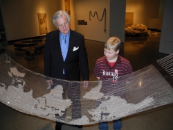
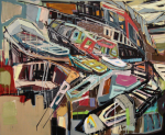
Spring Opening Reception @ SECCA: Fun and Folly
Yesterday evening we celebrated the opening of our latest two exhibitions – Jennifer Meanley: Far away, in the meadow and Eric Fertman: A Comic Turn.

Even the weather decided to relax and warm up in time for the beautiful evening festivities.


Opening remarks started at 6:45 pm in the Main Gallery. SECCA Director Mark Leach welcomed the great crowd of supporters and enthusiasts, and our Curator of Contemporary Art Cora Fisher introduced the artists. We were honored to have both artists at the event.

April Fool’s was a fitting evening to have the opening reception as the event was full of fun and folly.


Thank you to everyone who attended the opening. We hope to see you at another event soon! If you missed this event, stay tuned on Facebook or Twitter for the latest information about upcoming openings or subscribe to our e-newsletter via our homepage.
Post by: Adrienne Fletcher, Marketing + PR Manager

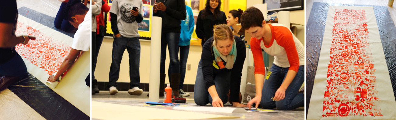
Pattern by designer Nadia Hassan using shapes created by students.
The Intersections Project (TIP) is a collaborative initiative launched by SECCA, Winston-Salem/Forsyth County Schools, and the Arts Council of Winston-Salem/Forsyth County that brings contemporary art into schools through artist residencies. Artists from all over the world work with students to make art that is relevant to their learning and their lives, while also providing resources that can be used by teachers in participating TIP schools, throughout the state and across the globe.

SECCA TIP Tessellations Lesson Plan
In the most recent TIP residency, students from R.J. Reynolds High School met with graphic artist, Nadia Hassan, to design and produce patterns for wallpaper. This residency was part of the Graphic Design – Now in Production exhibition, which includes wallpaper, and also recognizes the historical wallpaper in the Hanes House at SECCA. Hassan worked with students in geometry, e-media arts and introductory and advanced art classes. Each class made patterns in different media that connected with class content and skill level including tessellations, printmaking, digital and pencil-created repeated designs.
Ms. Hassan and students working on the project.
For the final project, students in each class designed shapes in foam and placed them on a roller made of PVC pipe. A pattern was printed with acrylic in one color on canvas using the roller as the printing device. Hassan digitized each shape, created a large pattern with the combined shapes from all the classes. This pattern was printed as wallpaper in the school colors – black and gold by Spoonflower, Inc., which donated rolls to Reynolds and SECCA. Museum visitors can see the TIP wallpaper on display near the auditorium. The wallpaper is available for purchase from Spoonflower and 10% of the proceeds from the TIP wallpaper go to The Intersections Project. The pattern is also available as a decal, fabric and wrapping paper in both the black and yellow and in multicolor.

Various classes.
Teachers interested in some of the lesson plans from this project can check them out on the TIP website. For a designer’s perspective on the project, visit Hassan’s blog where a second color option of the pattern can be found.

A group of TIP students admiring the finished project.
Post by: Deborah Randolph, Curator of Education

Béla Fleck and Abigail Washburn performing at SECCA
This past weekend, SECCA held its 9th concert in the SECCA Crossroads series, hosting banjo players extraordinaire, Béla Fleck and Abigail Washburn. The musical duo performed for two sold out shows at the museum, leaving most of us in awe and wanting more.
As my first Crossroads experience, the whole day could not have been more exciting. We started off with a lively music-themed Community Day, where the weather decided to be nice enough for us to be outside. There was an instrument petting zoo so that children could see, feel and hear different string instruments. We had another area with music- and banjo-themed books that parents could read to their children on the rug. Then of course, we had an very fun banjo-making craft project where everyone got to make a banjo and decorate. Even Béla Fleck came down for the fun! (There are more photos from Community Day on our Facebook page.)

As the sun began to set, the auditorium became filled with concert-goers. I had never heard Béla Fleck and Abigail Washburn live in concert, and I have to say, if you haven’t had the chance to catch them live, find a way! The two of them are just amazing and not only incredibly talented but also incredibly genuine. One of my favorite parts of the evening was in the first concert–Béla and Abigail’s son was in the audience and at one put he let out a squeal after hearing his dad. Béla played a few notes out to his son and we waited a second, and then out came another big squeal from his son. This happened a couple of times and it produced this very intimate moment between both parents (with beaming eyes) and their child, and it was such an indescribably human moment to be a part of. I think the whole audience could feel the connection across the auditorium between parents and child. It was just so special.

Right, and again, did I mention the talent of these two! There were goosebumps all around, I’m sure, during several songs. Plus Abigail did some songs in Mandarin, which I found particularly beautiful.
I think one of the most rewarding parts of the evening as well, at least for me, was hearing everyone’s reactions coming out of the concerts and hearing how awesome of a time they were all having as well. We love to see all of you here so we can’t wait to bring more concerts to SECCA with the Crossroads series! Crossroads #010 will happen sometime this summer–stay tuned on Facebook or Twitter for the latest information about the show or subscribe to our e-newsletter via our homepage.
Post by: Adrienne Fletcher, Marketing + PR Manager
4 African American Contemporary Artist to Watch
In honor of Black History Month one of our wonderful interns, Sherri Peterson, put together a short list of contemporary artists to check out. In the comments section, feel free to add your own list of artists!
John Bankston
John Bankston, “The Letter” Acrylic and Collaged Paper, 2003
First up, John Backston. Interested in the visual language of coloring books, Bankston uses his work as a platform to inform the viewer on issues of race, gender roles and in some cases health issues. Bankston creates visually an imaginary fairy tale world that relates easily with the viewer.
John Bankston, “Magic Handwashing,”
John Bankston, “The Fabulist’s Colored Life,”
Kara Walker
![Kara Walker, "Gone, An Historical Romance of a Civil War as it Occurred between the Dusky Thighs of One Young Negress and Her Heart [detail]," Cut paper original and templates w/signed certificate, 1994](https://seccablog.files.wordpress.com/2014/02/9910_12-kara_walker_6442_gone.jpg?w=480&h=607)
Kara Walker, “Gone, An Historical Romance of a Civil War as it Occurred between the Dusky Thighs of One Young Negress and Her Heart [detail],” Cut paper original and templates w/signed certificate, 1994
Much like Bankston, the next artist, Kara Walker, also uses illustrations as a formative platform that is easily digested. Walker appropriates characters from the 19th century black stereotypes depicting racial, social, sexually explicit, and in some cases violent narratives about slavery in the south. Using black paper cut outs in an illustrative way, she not only connects to the viewer on many levels but also shocks them. The black silhouettes against the bare white gallery walls is particularly poignant to the reflections about a white dominated society.
Kara Walker, “Untitled,” cut paper and adhesive on wall, 1998
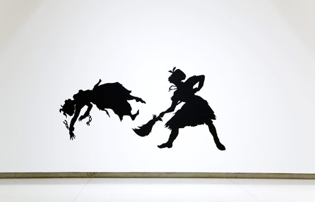
Kara Walker, A Work on Progress, 1998. Cut paper on wall, 69 x 80 in. (175.3 x 203.2 cm). Collection of Judie and Howard Ganek for the Whitney Museum of Art
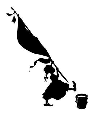
Rodney McMillian
Rodney McMillian, “Supreme Court,” 2000
Our next artist is from our sister state. I wanted to find someone that was close to home and not from a big city and wanted to show that even someone from a city like Winston-Salem could become an influential artist. Not unlike the two artists mentioned before, McMillians work has an underlining message of race. Primarily an installation artist, McMillian fuses together sculpture, painting and cloth to use light and dark as a way to illustrate the boundaries of economic stature, culture and the human body.
Rodney McMillian, “Untitled,” Vinyl and thread, 2010
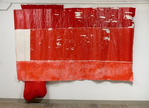
Rodney McMillian, “Untitled (flag),” Mixed media, acrylic on un-stretched canvas, fabric, grommets, 2006-2008
Hank Willis Thomas
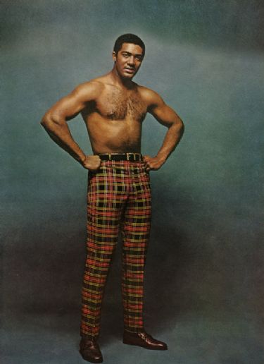
Hank Willis Thomas, “Slack Power,” (1969/2006), from Unbranded
The last artist is Hank Willis Thomas, a photographer, whose work also relates to race. Thomas engages the viewer through his photos to view how society has objectified the identity of African Americans. Thomas also takes a look back at the history of African American culture using symbols from the past and connecting them with future.

Hank Willis Thomas, “Branded Head, series: Branded,” Lambda photograph, 2003
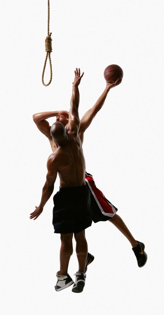
Hank Willis Thomas, “And One, series: Strange Fruit,” digital c-print, 2011.
Blog post written by: Sherri Peterson
Valentine’s Day Design

Pinterest VDay Card options, Pin by Matt Stevens, hellomattstevens.com
Roses are red, violets are blue…
If there is anything that our current exhibition (Graphic Design–Now in Production) has taught us, it’s that graphic design is everywhere and most certainly so on Valentine’s Day. From the packaging on chocolates to the sea of advertisements from restaurants and florists, and of course the endless options of cards and love notes, design helps illustrate love and friendship all day long.

Valentines Day Chocolate Wrapper by lovevsdesign.com

Valentine’s Day Google Doodle via google.com

Valentine’s Day Infographic by History.com and Column Five
Now using red lettering and lots of hearts seems like an easy job, but there is rhyme and reason to how designers work. There are six visual elements of design: color, line, shape, value (or tone), texture and form. And all of these together make the difference between cheesy and classy, friendly and intimate, eye-catching and eye-pleasing.

Valentine’s Day Card by Emily McDowell via emilymcdowell.com

“Valentine’s Day” movie poster via comingsoon.net

“Sweetheart 2014” artwork, Valentine’s Day Musical Collection available on CD exclusively at Starbucks
Simultaneously designers are also always using the principles of design: balance, economy, dominance, proportion, movement, harmony and variety. Clearly designers take a shot of steroids with their morning cup of multi-tasking.

Valentine’s print by David Goh (http://www.behance.net/david-goh) via creativebloq.com

Diesel Ad, Advertising Agency: Anomaly, London, UK
So as you get bombarded with love bombs all day and are trying to decide if an online Valentine is just as good to send as a paper one, stop and take a minute to analyze the design work of it all. How do the different elements express the overall tone? If it makes you laugh, why? Is it just the words? Or would they not be as funny without the visual elements?
Definitely leave us links to your favorite Valentine’s Day designs below in the comments.
And from all of us at SECCA:
WILL YOU BE ART VALENTINE?
“Love you winston-salem” print by CAPow
SECCA Exhibitions Through The Eyes of a Child
by Gordon Peterson, SECCA Foundation Board Member
Recently, I spent an interesting afternoon touring SECCA’s current exhibitions with Aidan, my 9-year-old little brother from the Big Brothers, Big Sisters program.
We walked into Vibha Galhotra’s Metropia exhibit with its works made of tiny bells and beads. His attention went immediately to the Dead Monster with its long body looping across the floor.
“Wow,” he said. “It looks like something I’ve seen in a video game.” Upon further review with a furrowed brow he proclaimed, “It must have taken a long time to make this.” I explained the long hours and the help from other Indian women to sew all the bells together and that they are like the ones we saw on the ankles of the Indian dancers he saw at a SECCA Community Day celebration. He nodded and said, “Yeah, I remember. They were cool.”
His attention quickly moved to the “giant snake,” better known as 15 Days in May and my first “why” question of the day.
“Why does she make these things?” I quickly responded as simply as I could that Vibha was expressing her feelings about her country through her art. He paused, and I could see another why question coming to the surface.
Before it surfaced, we moved on to Altering Boon, a hammock made of glass beads, wire and wood. “It’s pretty, but I don’t think I want to sit on it,” he said, which lead to a how question. “How did she make this thing?” I told him very carefully.
We then entered the Frank Selby: Misunderstanding exhibit, with its blurred photographic images drawn from chaotic moments in time of conflict.
“Are these pictures taken with a camera?” he asked. I told him they were drawings of photographs that prompted another why question.
“Why would he want to make a drawing of a photograph if he already had the photograph?” Aidan asked.
I quickly avoided a discourse on the concept of miscommunication in photographs and told him that the artist is making a drawing of what the photograph means to him and he is expressing that meaning.
Sensing a cloud forming in the eyes of the 9-year-old, I moved on to the next photo called Tullssa showing a crowd turning a car over. “What do you think of this drawing?” I asked.
“Why are those people so mad?” he asked in response. “Because,” I started … then stopped.
While we walked out of the exhibits and toward the parking lot, it occurred to me that SECCA is the perfect place to ask how and why questions, get some answers and then decide for yourself.
About Gordon Peterson:
A graduate of the University of North Carolina School of Journalism, Mr. Peterson has spent the majority of his career in the advertising agency business, both in New York and North Carolina. He worked for a group of diverse clients including Merrill Lynch, Avis, Pulte Homes, American International Group, The Walt Disney Company and The Washington Post Company.
A marketing consultant, Mr. Peterson is also on the boards of the Piedmont Opera and Friends of the Library, as well as the Docent Board at Reynolda House Museum of American Art. He served six years on the Winston-Salem Symphony Board. He is also a volunteer with Big Brothers and Big Sisters and Family House.
-
- Tomory Dodge Debris Pool 2003
-
- Denyse Thomasos Along the Yangtze, Boat 2003
-
- Tomory Dodge Dragon Teeth 2010
-
- Denyse Thomasos Albatross 2010
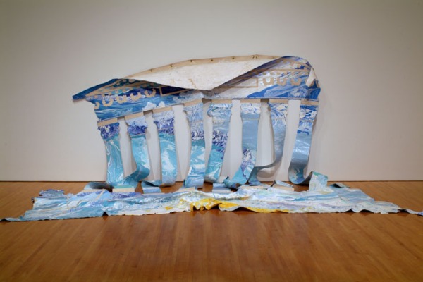
Tomory Dodge and Denyse Thomasos (1964-2012) use paint to create spaces—whether natural or architectural—on their canvases. At the same time, they remind the viewer that, in fact, we are looking at a painting. Though Dodge’s more recent paintings are primarily abstract, his work involves creating territory on the canvas that is somewhat overlooked: strange places we have all experienced but sometimes wish we hadn’t. In Tomory Dodge, a catalogue co-produced by ACME and CRG Gallery, Jeffrey Ryans mentions a Victor Hugo quote that aptly describes the places Dodge is trying to (re)create in his work. Hugo writes about locations that are “somewhat ugly but bizarre, made up of two different natures…ends of trees, beginnings of shops, ends of beaten tracks, beginnings of passions…forever marked by the passerby with the epithet “sad.” In Dodge’s work we become the passerby, and we connect to the scenes in his paintings because we’ve experienced or imagined them before. For many people, these places hold mystery, and maybe even nostalgia.
Thomasos, on the other hand, is interested in creating interior spaces that reflect her personal and cultural history. Thomasos moved from Trinidad to Canada when she was seven years old and felt isolated in her new environment. This feeling echoes through her intense, contained spaces. Her paintings often pertain to displacement as well as works that comment on slavery, genocide, and imprisonment. The political statements reside in the structure of her work and the isolation and displacement in the interior, weaving together her personal and cultural history through color and line.
I will discuss a few of the pieces in the upcoming SECCA exhibition (opening March 22nd) that articulate core elements of the artists’ respective practices. Dodge’s 2003 Debris Pool exemplifies his interest in places where nature and the beginnings (or endings) of urban life and industry meet. He has many underlying themes in his work, but this particular painting relates to apocalypse and aftermath. In this piece, we are seeing what could be the wreckage of a storm or a pool that has been neglected and filled with dirty detritus over time. On first glance you might not see that you are looking in a pool because of its abstracted nature and Dodge’s use of paint. Globs of white are the reflections in a sickly green pool of water. An image of a pool full of floating debris is not necessarily an attractive one, but Dodge makes it seductive through his celebration of paint and color. The piece, like many of his works, is a reminder of entropy: the inevitable and constant decay of matter present in everyday life. Thomasos’s 2003 painting Along the Yangtze, Boat is an abstract, almost monochromatic piece in which one can find the structure of two boats in its geometric network of white lines. The Yangtze River is the third largest river in the world, and it has been a life source for Chinese people for thousands of years. Thomasos is using abstraction to create an interior space—the boat—which represents travel as well as displacement. It speaks to her own feelings of displacement as well as the uproot of people who were affected by the construction of the Three Gorges Dam.
Dodge’s more recent work is significantly more abstract; bright color and gesture are essential to his pieces, and the titles of each become increasingly important in the reading of each painting. Dragon Teeth (2010) has a bright array of colors against a green background reminiscent of the acidic water in Debris Pool. The strong lines in the piece move the eye downward (as if each brushstroke could be imagined as a sharp tooth) while the rainbow colors contrast with the danger implied in the title. Behind each brushstroke one can see multiple layers of paint, and in effect, the painting is about painting and the overwhelming power of color. Thomasos’s 2010 painting Albatross is similarly abstract and vibrant—asserting that at its core, this piece is a painting regardless of the architectural allusions she creates within it. The piece uses line and gesture to create a building structure that is initially unclear, hidden by the layers of paint and a variety of colors. Hearing the title, I am immediately reminded of my high school English class and reading “Rime of the Ancient Mariner” by Samuel Taylor Coleridge. In the poem, the albatross becomes a metaphor for burdens and obstacles. In the painting, it seems that the albatross represents the obstacle of containment and the burden of isolation. The architectural forms in the piece could represent a jail as well as a more personal loneliness; one that many experience in the movement across borders.
Both Dodge and Thomasos are using paint and gesture to shed light on spaces that we might wish to overlook, ignore, or avoid. They fashion ambivalent spaces that call to question some of the horrors of history, and some of the promise that arose from the ashes. Though Dodge’s paintings are “exterior,” combining nature and the crumbling outskirts of industry and Thomasos’s paintings are meant to be interior, representing containment and isolation, they are both working to create an atmosphere—a specific place that spans perimeters and geography.
I encourage you to experience the exhibition in person. Directions to a Dirty Place will be on view until September 1, 2013 and Tomory Dodge will be giving an artist talk on Wednesday, March 20. Please visit the SECCA website for more details.
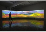
If I were Curating Upcoming Jennifer West/ Jacco Olivier Exhibition
-

- Jennifer West Dawn Surf Jellybowl 2011
-
- Jacco Olivier Rabbit Hole 2011
-
- Jennifer West Whatever 2007
-
- Jacco Olivier Cycle 2012
Jennifer West and Jacco Olivier use film and video in unusual ways. While Olivier creates animations from his vivid paintings, West uses a variety of strange materials, (from pennyroyal tea to mascara) to create her “direct films.” A direct film is not constructed (or “shot”) by a camera but rather created as the artist exposes the film to various elements. West’s direct films also have an unconventional performative element that sets her works apart in today’s “touchless” digital frontier. West uses everyday materials to comment on pop culture—particularly that of her California culture—from surfing to Nirvana. Olivier’s animations are, on the other hand, made from loosely painting a narrative—continually painting and repainting the surface of his canvases until he completes his concept, and every step is recorded by/on camera. While each artist has a different process, they are both utilizing bright, hypnotic color and painterly actions in the creation of their films/animations. As Olivier’s works come from continual constructions of everyday life upon and unstable “canvas,” West is systematically altering her filmstrips with unusual chemicals to give the viewer a visual, sensual experience of the elements in her work. These concepts range from a physical assault of the film leader to covering it in materials that were a part of the movie’s treatment, whether that material was tasted, smelled, or referenced in context of the film.
Both artists are contemplating the ordinary in the films Dawn Surf Jelly Bowl (16 mm film negative sanded with surfboard shaping tools, sex wax melted on, squirted, dripped, splashed, sprayed and rubbed with donuts, zinc oxide, cuervo, sunscreen, hydrogen peroxide, tecate, sand, tar, scraped with a shark’s tooth, edits made by the surf and a seal while film floated in waves…) by West and Stumble by Olivier. These films are studies of the everyday, which in Olivier’s case involves a day in the life of a bug; West’s recalls surfing and the hedonistic California lifestyle (her home state). Though these are the basic premises for their pieces, their ability to capture the ordinary makes a great impact. West’s 2011 film is meant to evoke early surfing films that were made for surfers before the field was commercialized, and all of the elements in the title were used in creating the film to give it multiple sensory components that reflect surfing culture. Stumble (2009), on the other hand, is a series of paintings of a bug in different times of the day as it struggles on its back—trying to and eventually turning over as the sound of crickets play gently in the background. An upturned bug is a common sight, one that is easily overlooked until it is playing on the screen. Stumble might thus refer to the human condition: our inevitable series of downfalls and recoveries. All the while, the series of paintings are vividly colorful—evoking West’s use of saturated color, and the processing that these pieces embody to translate the everyday into reflections upon culture, sentiment, and the human condition.
Thoughts on Vibha Galhotra: Metropia
-
- Vihba Galhotra Landscape Remade 2011
-
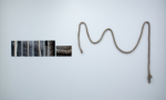
- Vibha Galhotra 15 Days in May 2011
-
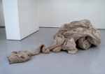
- Vibha Galhotra Dead Monster 2011
-
- Vibha Galhotra Sediment 2011
The first time I walked into Vibha Galhotra’s exhibition, Metropia, I was taken aback by the colossal size of her works. The immense tapestry-like “Veils” and sculptures are formed with ghungroos: tiny metal bells that Indian dancers wear during performances. Bringing these two elements together—the ghungroos and the size of the works—is a visual marriage that creates a powerful message about the effects that rapid building in New Delhi has had on the city, its history, and environmental issues. The massive scale of her work evokes the modern buildings of New Delhi while the ghungroos suggest the citizens affected by the development of the city. The shining metal of the ghungroos, which are quite reflective in the light, could embody new construction while also representing cultural tradition. The ghungroos almost create a visual sound as if, when you look at the piece, you can hear the bells ringing in a way that mimics the hustle rapid pace of city life.
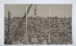
Though the exhibition is filled with Galhotra’s “Veils” (abstract landscape tapestry-like landscapes made with ghungroos), I am going to discuss two of these objects from the exhibition that reflect her message. Landscape Remade depicts a cityscape in a triptych of three tapestries. Though the image is luminescent in the light, the use of the various colored metallic ghungroos is reminiscent of a pollution that plagues the city—turning the vibrancy of color associated with nature into a metallic grayscale. A crane pierces two of the tapestries, and the eye is drawn immediately to the ominous hook in the center of the tapestries. The buildings are overwhelmingly present, and there is no sense of nature in the piece, reminding the viewer of the change caused by erasure of the environment.
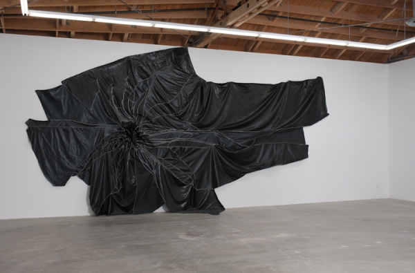
Another piece that is striking and sizable is called Dead Monster, the skin of a deflated bulldozer. Galhotra has created many “monsters” in protest of construction and damage done to the environment. Dead Monster is sprawled out across the floor as if defeated in battle, giving it a sense of hope for the future, as well as awareness. This sculpture is also made of ghungroos that evoke the metal of the bulldozer as well as the echoes of tradition. The idea of this bulldozer being “dead” represents its cold, lifeless quality as opposed to nature and comments on how such dead objects are haunting present life.
Though Galhotra works with ghungroos in a lot of her pieces, it is not her only medium. She also utilizes New Delhi to create art that informs her audiences of the pollution and the way that other people are affected by environmental neglect. Galhotra’s mixed media piece Sediment is a stunning work of abstraction. On closer look, one realizes that the medium she used to create this piece is collected waste from the Yamuna River, the largest tributary of the Ganges River (the most sacred river in India). Sediment is a mixture of beauty and shocking revelation, and it is a strong reminder of the pollution that people encounter, create, and ignore on a daily basis. Seeing the piece for the time and learning the medium reminded me of the environmental problems we all face and to be more aware of the consequences of pollution. Interestingly, Galhotra creates a visual dialogue between art and awareness, which makes this exhibit so enlightening.
Another piece that employs daily life in New Delhi as the medium is 15 Days of May. This work centers around a rope that was placed outside in the city to accumulate ambient dust and detritus that are present in the city for a period of fifteen days in May. As you look at the photographs of the rope before it was exposed to the dust and grime of the city, the ropes are clean and unmarked—making their shift to crusty gray innards all the more unsettling. These works are a reminder that we should be more proactive in taking care of the places in which we live, whether its New Delhi or Winston-Salem. What’s so interesting about Galhotra’s is that she creates art with materials and subject matter that people tend to ignore (or attempt to ignore) on a daily basis—bringing these issues to the forefront of our attention. Her works are a reminder that we should be aware of the environment in which we live while also calling to question what art can be. She gives ordinary—or even disgusting—objects a new context with a powerful message that is meant to make us think about ways in which we contribute to the destruction of our environment and ways in which, however simple, we can improve it. Metropia is on display at SECCA until Sunday, February 17, 2013.
Thoughts on Frank Selby: Misunderstanding
-
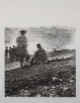
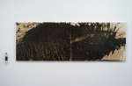
- Frank Selby 2008 stare into the lake astonished Graphite on Mylar
Salisbury, NC-based artist Frank Selby’s exhibition, Misunderstanding, is showing at SECCA until February 17.th His painstaking attention to detail and highly naturalistic drawings copied from old press photographs are a testament to the decay of memory. This theme runs through all of his drawings and branches into other concepts on the failings of language, image, and how the two can distort the truth. On my first night in Winston-Salem I watched a documentary called Between the Folds (about the art and science of origami) and found that paper folding and Selby’s work have analogous principles. In the film, origami is compared to making memories and impressions in paper through folding. Once folded, the paper can never go back to its original state. Similarly, Selby demonstrates that the old photographs he copies are manipulated memories that not only physically decay with time but also lose their context through language and his own manipulation (cropping and resizing) of the photograph. This process continues until the moment originally “captured” has been skewed—making a statement unintended for the original work that cannot revert to its original state.
Selby replicates old photographs with precision, including all the flaws that accumulated during the shooting and developing processes as well as the inescapable disintegration caused by time and wear. To do so is to show that a photograph is not an absolute rendering of a moment. A photograph can be posed, cropped, resized, and damaged. He further distances his drawings from their intended meanings by giving them a title that removes the photo from its original context. Selby also resizes the photographs to re-scale the origin and meditate upon the intention of the photograph.
Selby states, “Every message is perverted from its inception in language and gains more distortion through each iteration and reproduction,” which gives us a sense of what his work is truly about. A prime example of his theories about language and communication is prevalent in the drawing stare into the lake astonished. The photograph he draws from is an appropriated, cropped image of Civil War soldiers overlooking a battlefield. Selby re-scaled this particular image to show two soldiers, but in the original, there is a group of soldiers posed on the right side of the photo who are supposed to be the focal point. His interventions are slight, but their affect is large. Selby is shepherding change, but not through his drawing technique as he attempts to make exact replicas of these photographs. Instead, he highlights the inverse relationship of trying to know and remember a moment or image by copying it—whether by hand or eye. His work is re-documenting the moment captured in the photograph as a semblance of a memory, and it is physically deteriorating in the same way that memory fades with time. Also, the title that Selby gives the piece—stare into the lake astonished—gives the subjects (and the indiscernible background) a new context since in the photograph, it appears as though the figures are looking onto a battlefield. This piece exemplifies Selby’s desire to demonstrate the misleading nature of language as well as image, furthering the idea that image generates miscommunication.
Selby’s exhibition, Misunderstanding, was given its nomenclature because all of Selby’s works, in one way or another, are intentionally meant to be misunderstood. We are meant to misunderstand the image because he re-presents the image in such a way that ultimately subverts the concept that photography shows truth and that one can use language to create an imagined context for any image.
